Visual identity + Social Media Design
Client — Bridge The Gap San Diego
Bringing San Diego's Filipino American community together through a shared love for cultural cuisine
Hello-Halo! was a foodie mixer hosted by Bridge The Gap San Diego (BTG), a newly incorporated nonprofit organization, in September 2024. Playing on the word "halo-halo", a classic Filipino dessert, Hello-Halo! brought together small businesses, up-and-coming performers, and Filipino food enthusiasts in an event centered around the Filipino American experience through cuisine. Over four weeks, I was tasked with crafting a new visual identity and static social media graphics to promote the event on the organization's Instagram.
Moodboard and Inspiration
With this event's food-centric focus, I was inspired by the idea of the Filipino pantry and kitchen. Drawing from my experiences as a Filipino American, I referenced ingredients found at Filipino supermarkets and my grandparents' house in my childhood. I thought that vibrant colors, similar to those found on these products and in fresh ingredients in Filipino cooking, could meld well with BTG's existing palette and reflect the fun and lively atmosphere of the event.


Logo Development
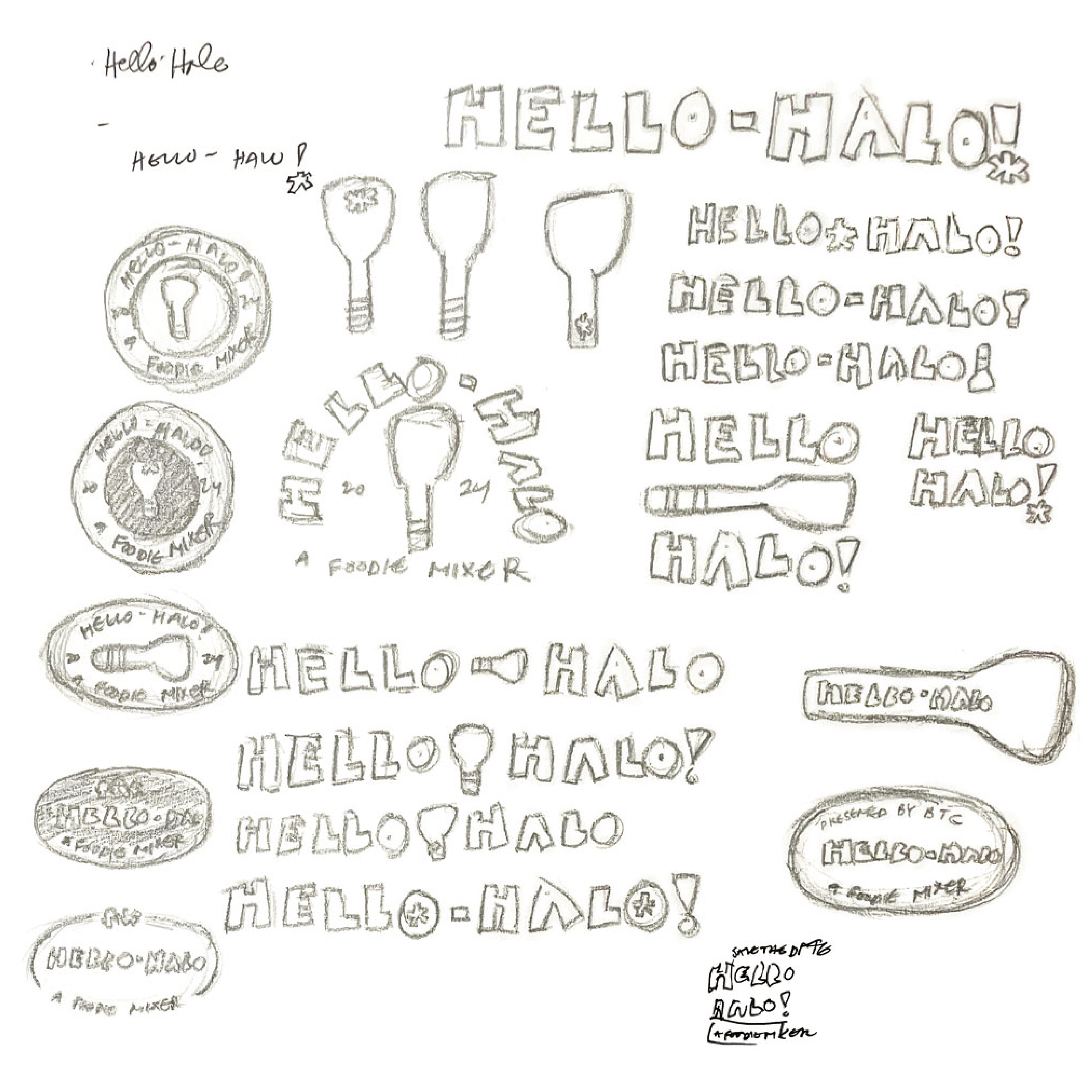
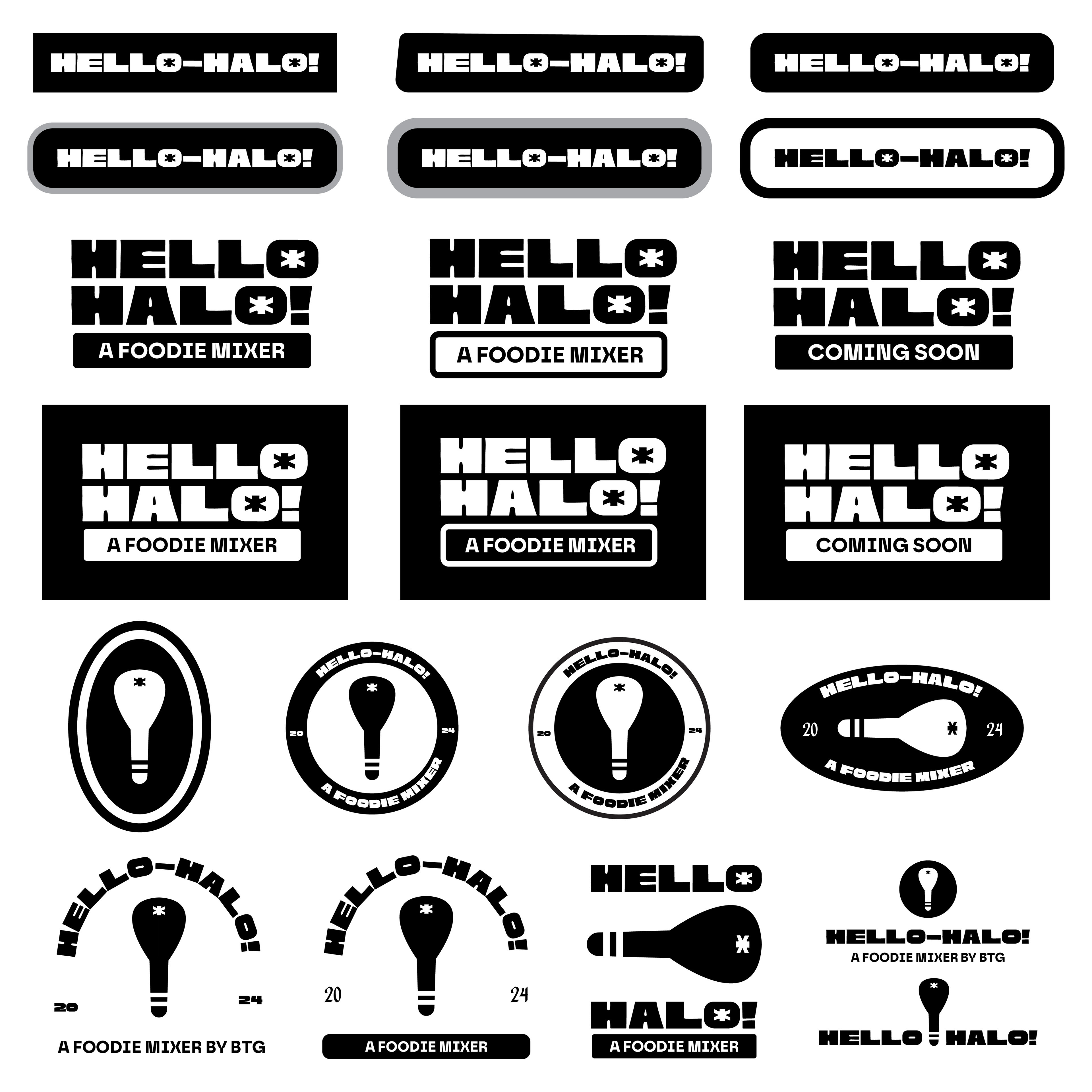
When exploring logo ideas, I initially pulled inspiration from the rectangular labels and logos referenced in my moodboard. Leaning further into the concept of a Filipino kitchen, I thought of common cooking tools and utensils that could inspire a logomark or icon for this system. The rice paddle stood out as an object that could easily be simplified and symbolize the role of food in Filipino culture: similar to how rice brings together all dishes in every Filipino meal, food often serves as a point of connection and community for people in the Filipino diaspora.
Expanding the System
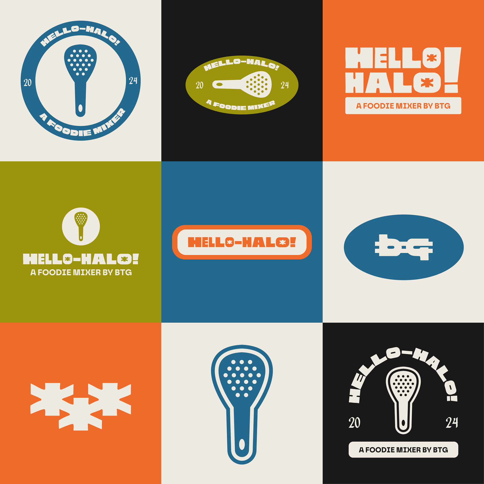
To keep Hello-Halo! connected to BTG's existing identity, I pulled several elements from the organization's guidelines into this event's system. The rice paddle joins BTG's two icons, used as assets throughout the event's social media posts. The typefaces Cubao and Martires pull inspiration from Filipino hand-lettered signs, paired with Safiro to bridge modernity with the system's more traditional references. A vibrant green and orange, named after the Philippine bitter melon and lemon, were grouped with select BTG brand colors to resonate with a bold and bright Gen Z audience.
view full Performer Lineup post HERE
VIEW FULL vENDOR lINEUP POST HERE