Event Branding + Naming
Client — San Diego State University / School of Art and Design
An annual open studio event showcasing work by San Diego State University's graduate art students
Open Studios is an annual event that showcases work by graduate students at San Diego State University's (SDSU) School of Art and Design and allows visitors to tour the school's studios and galleries. Because this event was scheduled to take place on the same day as Explore SDSU, an open house event for newly admitted students, the main poster needed to appeal to the School of Art and Design's faculty and student body, as well as newly admitted first-year students, transfer students, and their families.
Research
At the beginning of this project, I had the opportunity to tour through the Art North and Art South buildings at our campus to gather inspiration. Though I assumed I was already well-acquainted with these buildings as a School of Art and Design student, this tour opened my eyes to the multitude of disciplines and workspaces supported by our school. Beyond the graphic design classrooms and ceramics studios I was already familiar with, this tour helped me gain insight into the creative processes of the graduate students specializing in painting and printmaking, furniture and woodworking, jewelry and metalsmithing, and photography.
Illustration and Naming
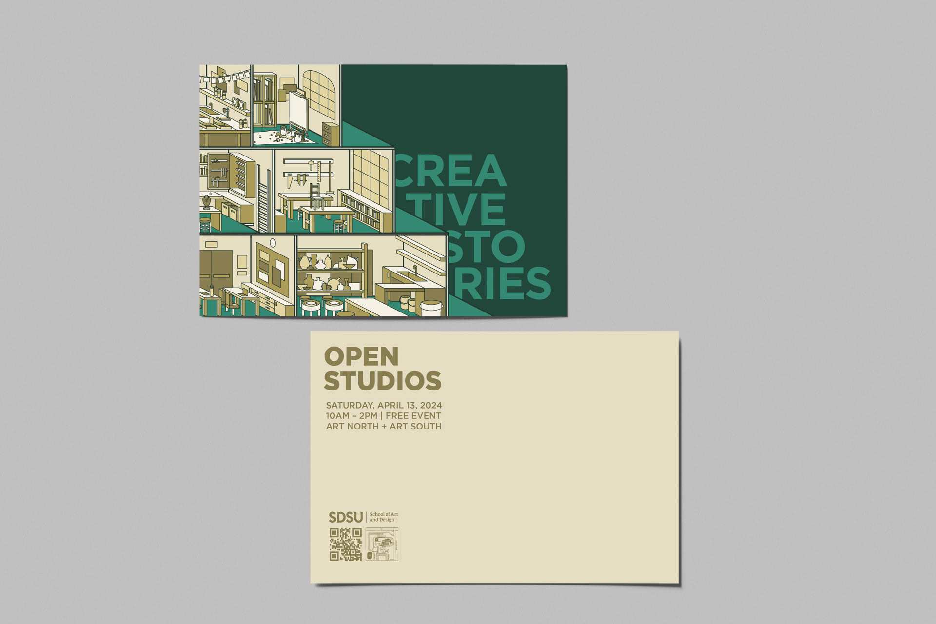
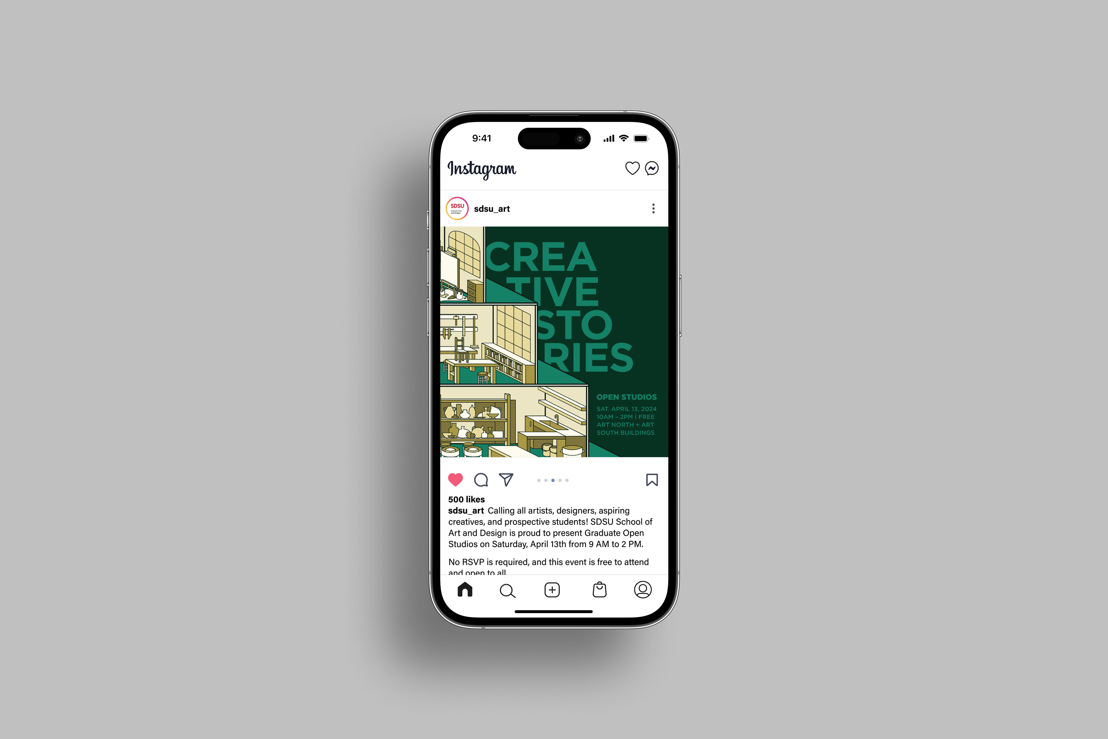
Heavily inspired by the tour of Art North and Art South, I wanted to find a way to capture the buildings' unique multi-level layout. The concentrations of the graduate students participating in the event—photography, painting and printmaking, graphic design, jewelry and metalsmithing, furniture and woodworking, and ceramics—were represented in the different levels and rooms in the illustration.
With the freedom to suggest potential names for the event, the chosen name "Creative Stories" serves as another reference to Art North and Art South's multi-level layout. The name also nods to the diversity of works and themes to be presented at the exhibition, showcasing pieces of the artists' journeys as graduate students at SDSU.
Colors and Typography
Though sticking strictly to SDSU's existing brand guidelines was not required, I still wanted to find a way to pay homage to the school beyond the illustration. The color palette I chose for the system is a subtle nod to the paint colors found on the Art North and Art South buildings. To match the clean and minimal style of the illustration, Gotham was the sole typeface used in the poster, postcard, and social media graphic.

