Visual Identity + Naming
Food and Beverage BRAND
Building a brighter future with every Billie bottle
Billie is a casual lemonade brand that pays homage to the good ol’ days, channeling retro nostalgia in its simplicity and playful visuals. By working with growers and manufacturers that have the future of the planet in mind, and by donating a portion of their profits to several youth-centered organizations, Billie hopes to rekindle a sense of community within the modern day.
Moodboard and Inspiration
When gathering inspiration, I first looked towards lemonade stands that you might find around an American neighborhood, and the frequency of hand-lettered signs quickly stood out to me. I leaned into this homemade and casual feel by studying illustrations from the 1960s and 1970s to reflect the nostalgic aesthetics of classic American suburbia. Author and illustrator Leonard Kessler became a major source of inspiration during this stage.
Name Ideation and Logo Development
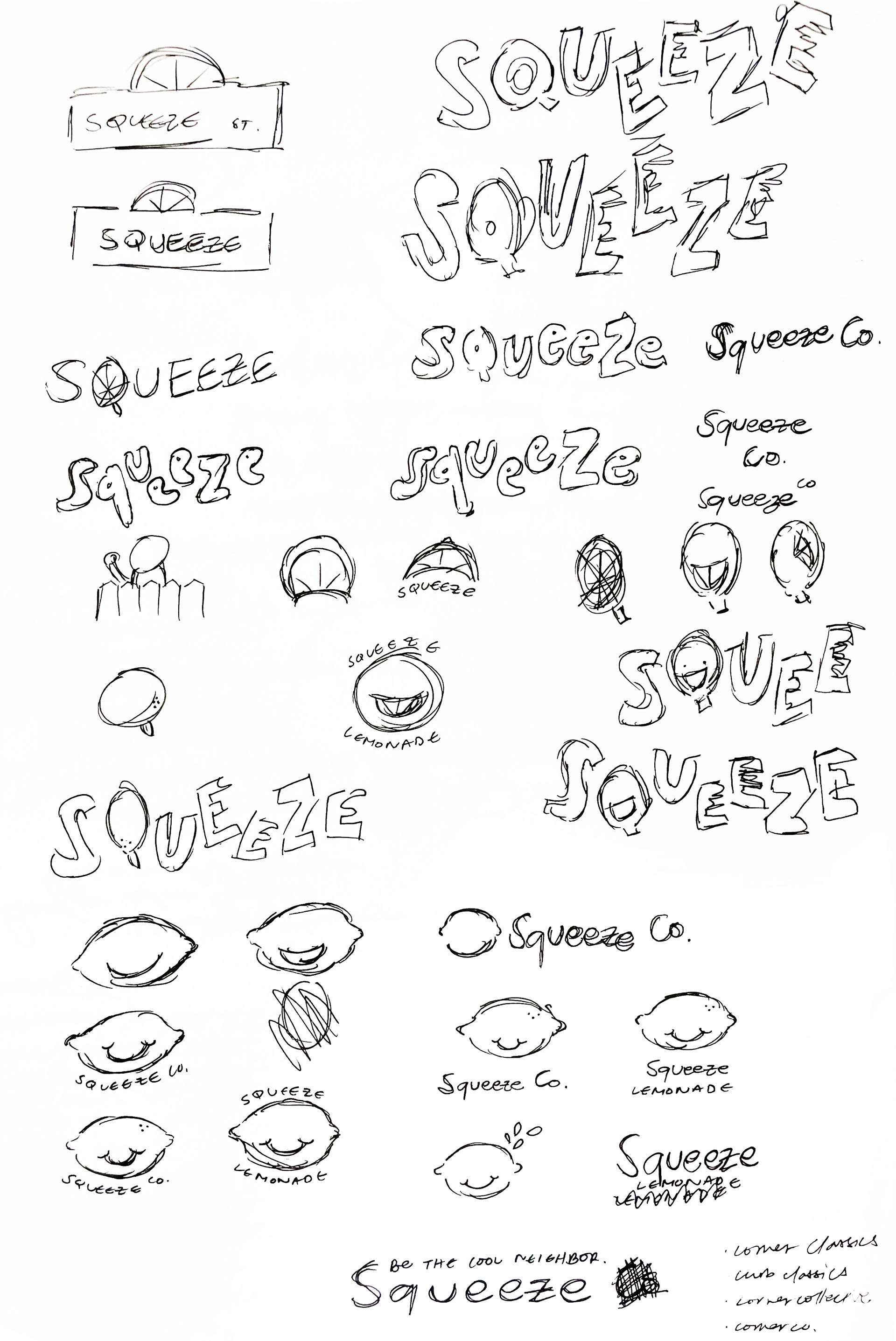
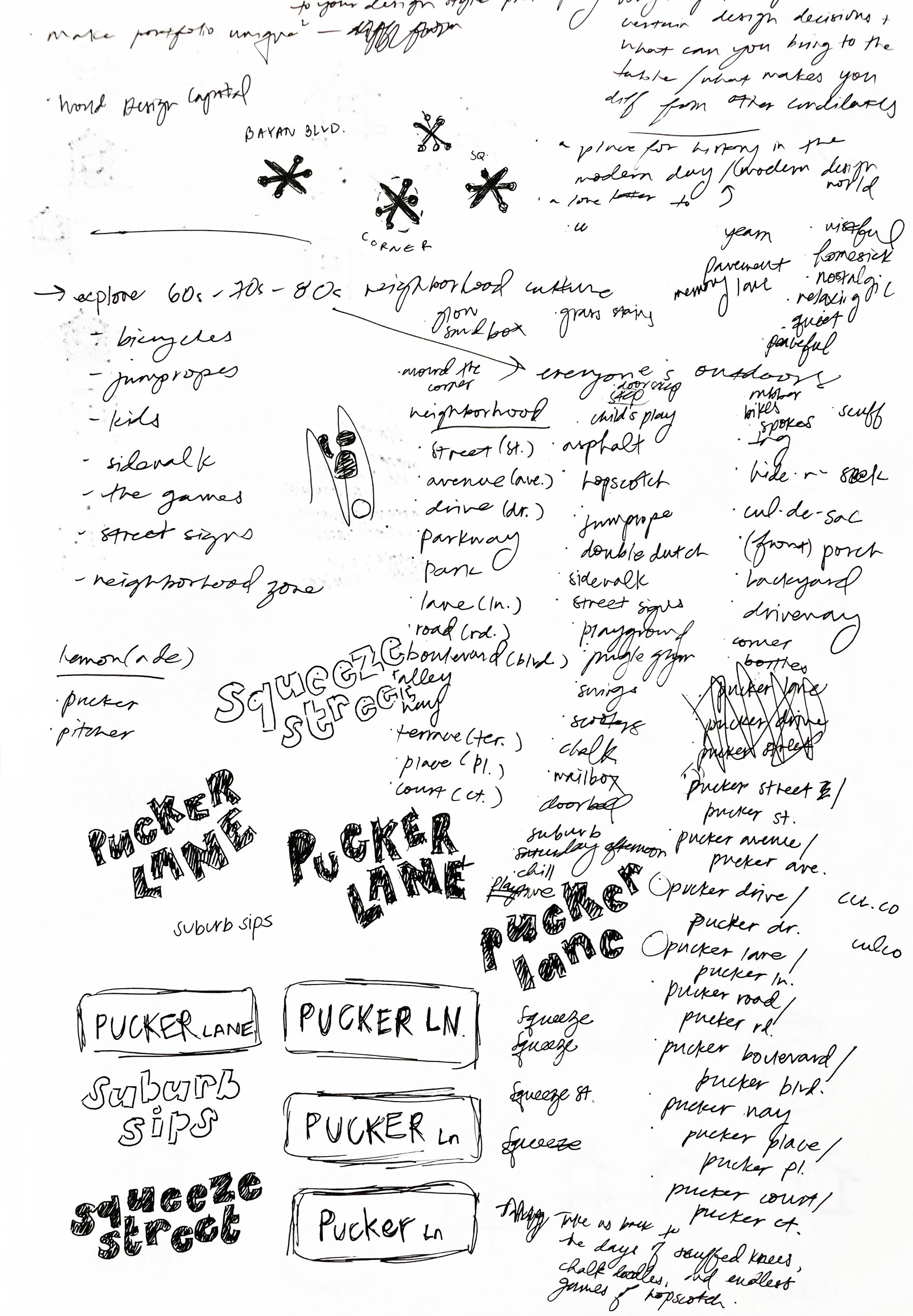
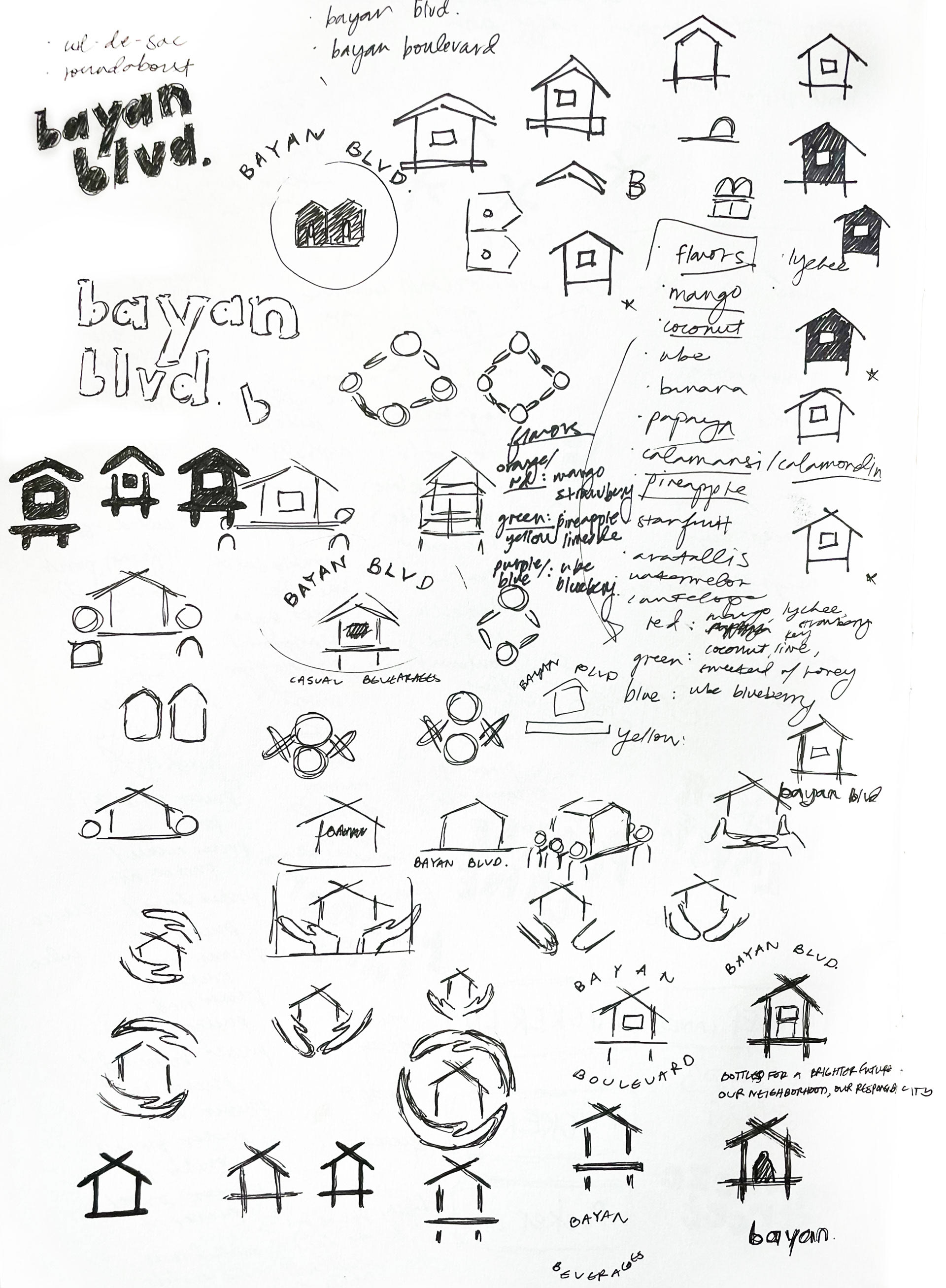
During the name ideation and logo development stage, endless word lists and sketches helped me find a name that felt right for this brand. Early in this process, I explored words closely related to citrus and juicing, but quickly realized those words would be too obvious for a lemonade brand. I then pivoted to exploring neighborhood-related words and imagery, and even concepts that reflected my upbringing as a Filipino American.
Final Name and Logo
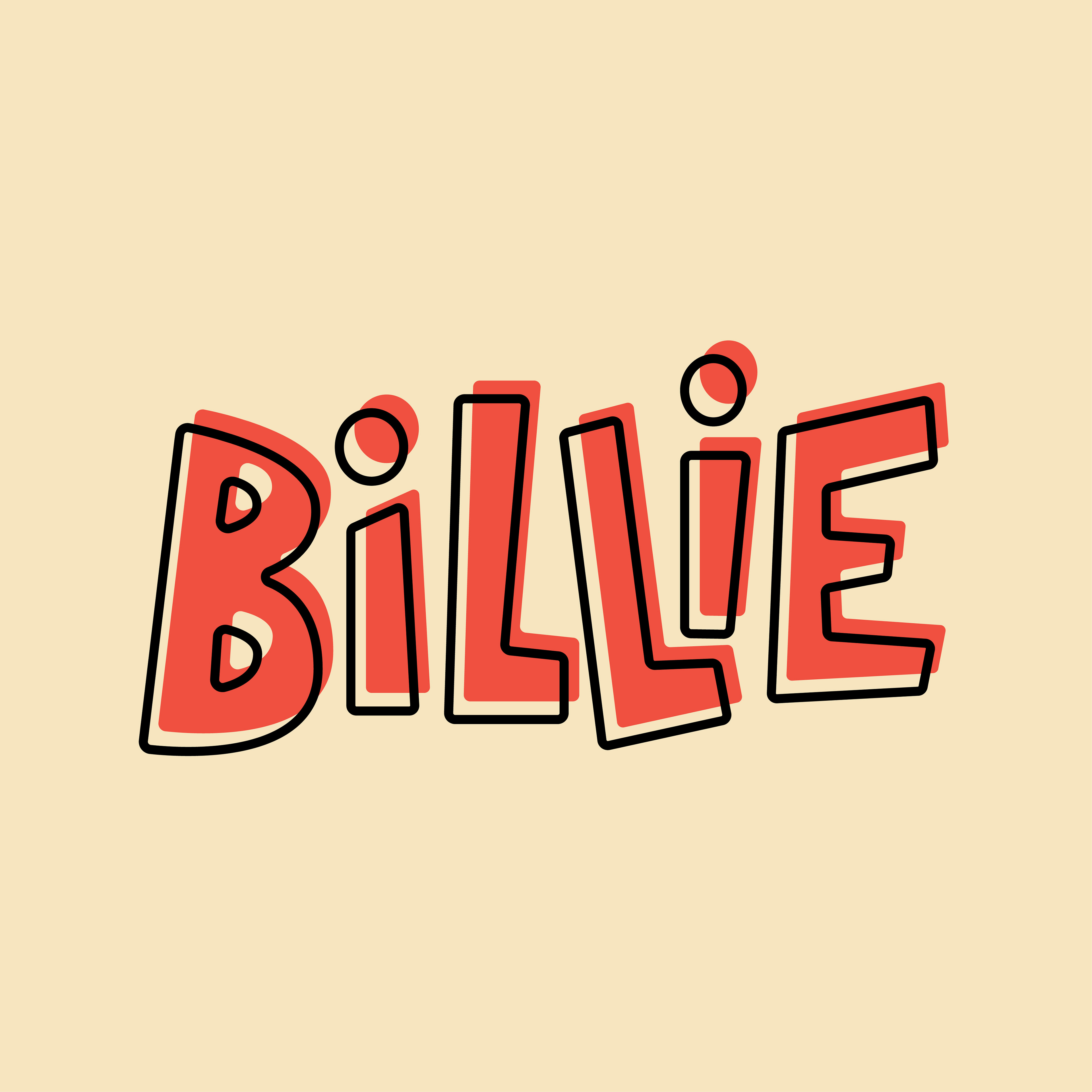
The final name, Billie, feels youthful but familiar—a next-door neighbor, an old classmate, a childhood friend you’ve lost touch with over time. This common American nickname highlights the brand's friendly and neighborly personality.
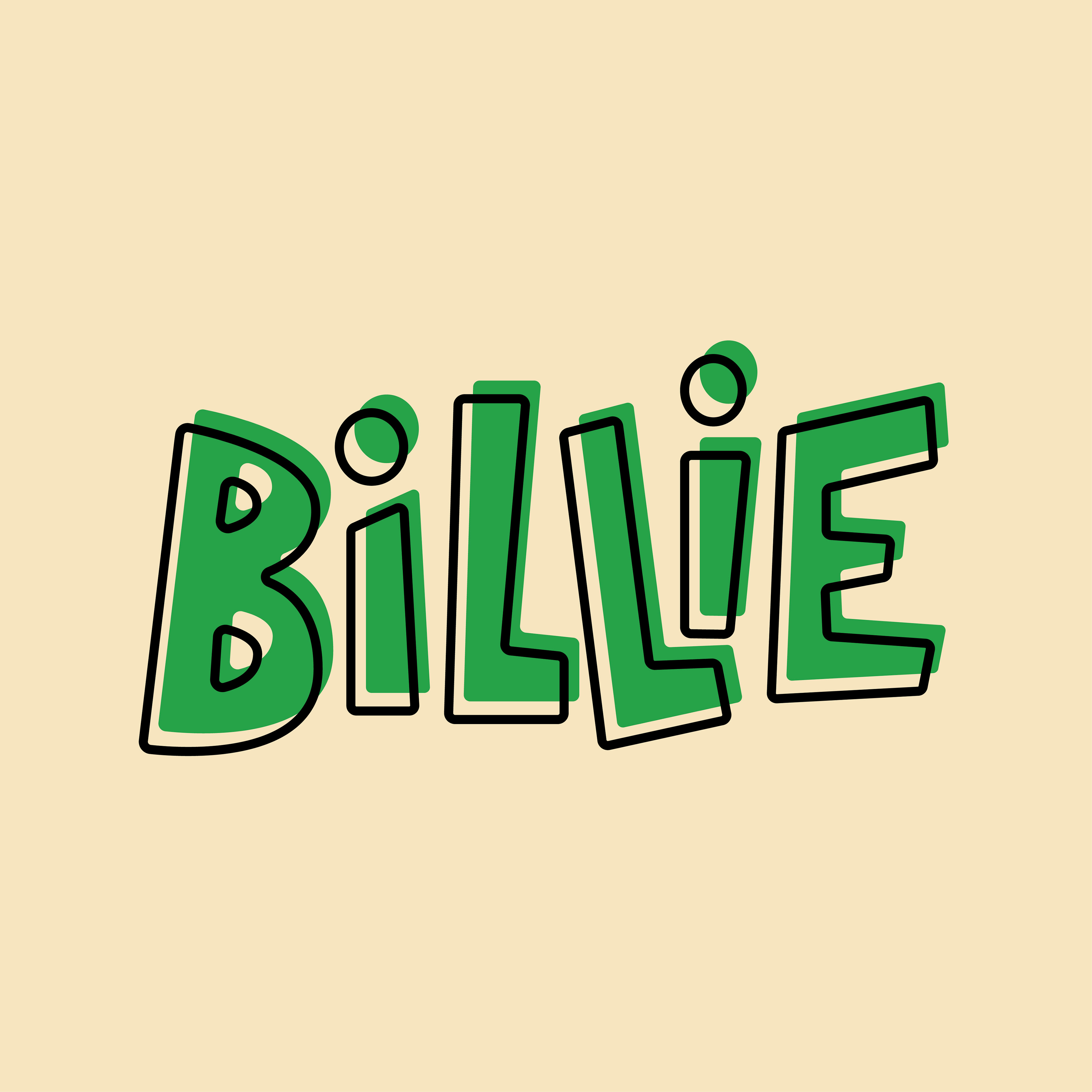
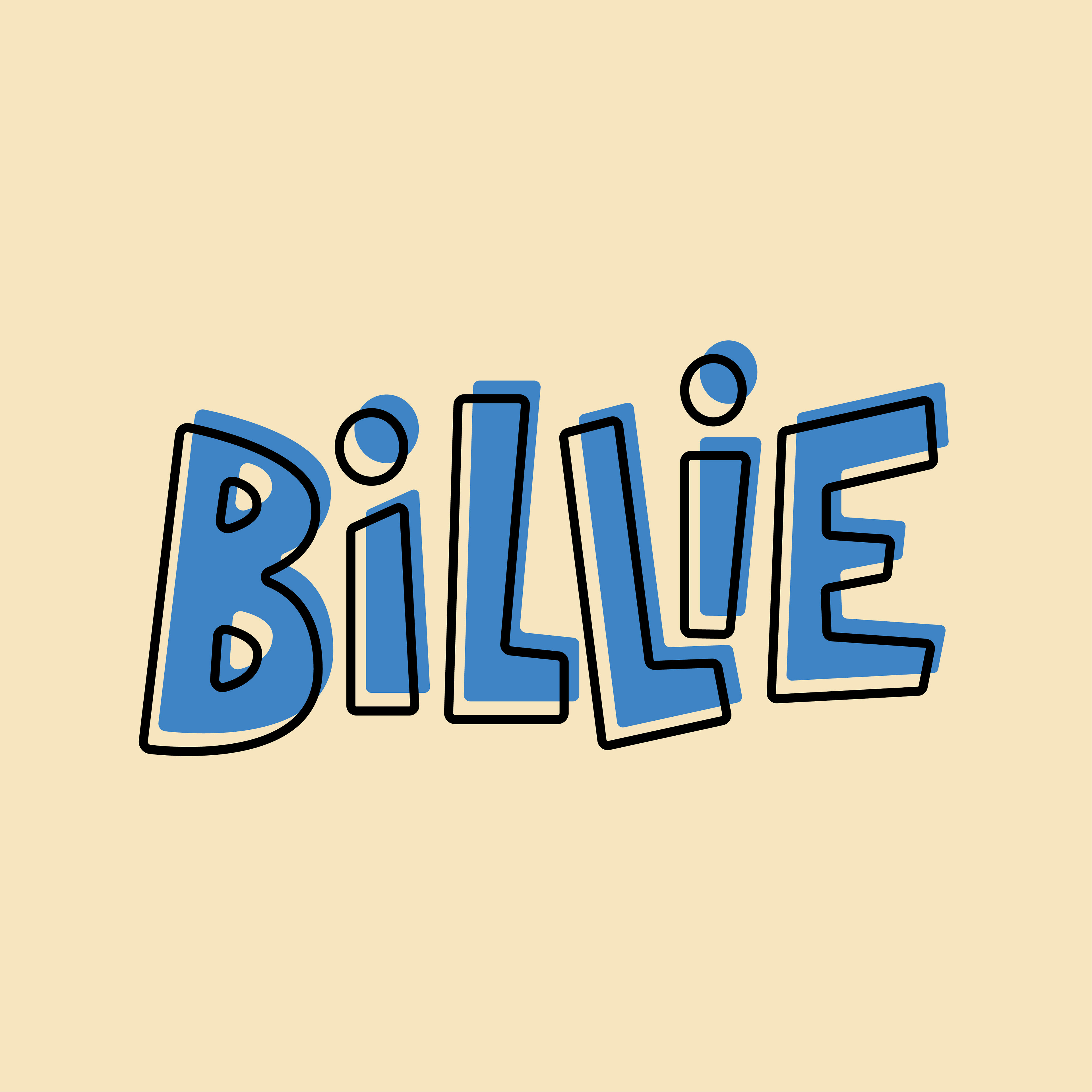
A mixture of tilted, handmade capital and lowercase letters conveys the brand's youth and playfulness, reminiscent of the hand-lettered signs often found on lemonade stands. Outlined letters are layered on top, inspired by messy coloring pages and coloring outside the lines.
Colors and Typography
Red, green, and blue were chosen as the predominant brand colors to evoke feelings of simplicity and familiarity. Gotham XNarrow and Gotham Condensed call back to the retro nostalgia of the 1960s and 1970s that served as a core source of inspiration throughout this project.


Illustrations
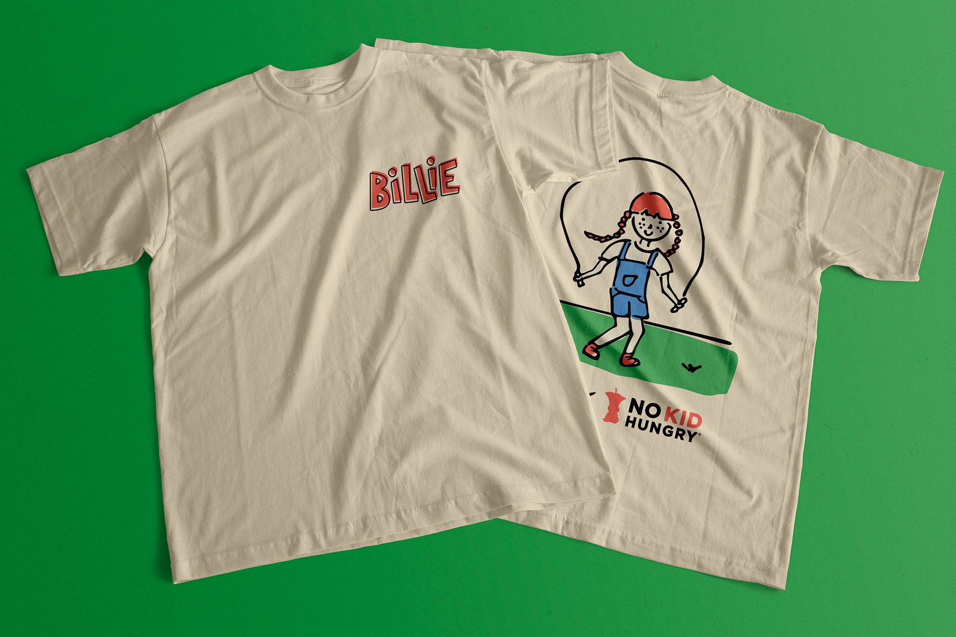
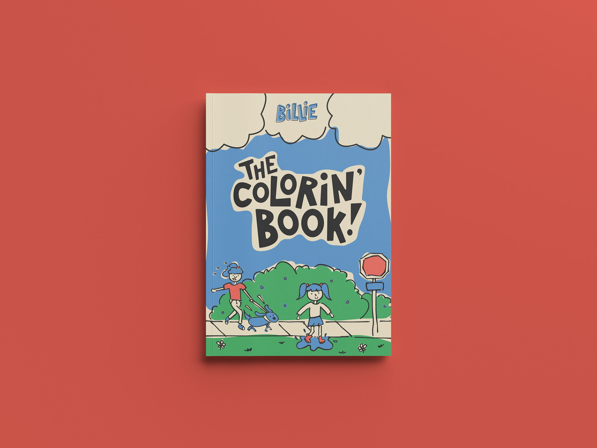
The loose and playful illustrations used across Billie's labels and collateral were created to match the logo, with the brand colors strategically applied to differentiate the beverage flavors. Lighthearted scenes of children playing around the neighborhood (or being walked by their dogs) emphasize a feeling of community and togetherness that Billie aims to restore.
